Edit Content
Click on the Edit Content button to edit/add the content.
Optimizing Greenlight Online Bookstore

Key Words:

UX Research, Usability Testing, Information Architecture (IA), Competitive Analysis, Card Sorting, Tree Testing, Prototyping


Tools:

Figma, Miro, Optimal Workshop,

Google Forms, Notion

Prototype Link:

Desktop: Here

Mobile: Here

Project Overview

Greenlight Bookstore’s website offers numerous services, from book browsing and purchasing to event promotion and memberships. However, the website struggles with disorganized content, unclear navigation, and overwhelming information, making it difficult for users to quickly find what they need.

Our goal was to optimize the user experience by redesigning the website’s information architecture, simplifying navigation, and improving the browsing flow. Through research, testing, and iteration, we created a solution that makes Greenlight’s services more accessible and intuitive.


Research & Analysis

To understand readers’ preferences and behaviors in browsing, discovering, and purchasing books—both online and in physical bookstores—we conducted interviews with eight participants. This phase focused on identifying what users value most in their reading and shopping experiences.

Interview Insights Organized Using Affinity Mapping
Insights Synthesized from FigJam Content

Based on the insights gathered from the user interviews, I created a persona to represent the typical reader and their needs. Since our goal is to optimize the website, the persona highlights key aspects of a reader’s goals, behaviors, motivations, and frustrations, with a specific focus on their online experience.

To explore the design space for our new website, we conducted a systematic review of 8 direct competitors and 1 indirect competitor. Using 6 key dimensions (see table below) and a 3-point rating scale, we evaluated each competitor’s performance. This analysis helped us identify trends and opportunities to inform our redesign.

To improve the website’s structure, we began with Card Sorting to understand how users naturally group information. We then conducted 2 rounds of Tree Testing to ensure the new navigation made it easy for users to find what they needed.


The diagram on the left is the Card Sorting Matrix, which shows the results of how participants grouped the labels. It reveals the relationships between labels and indicates whether they are suitable to be organized into a category.

After grouping the labels into several main categories through Card Sorting, we wanted to test whether users could quickly find specific labels in our redesigned navigation bar. This image shows the testing scenarios we created and the key labels we aimed for users to locate.

Design Process

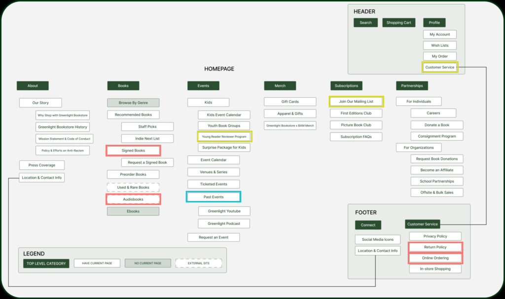
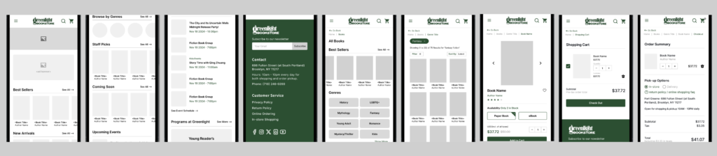
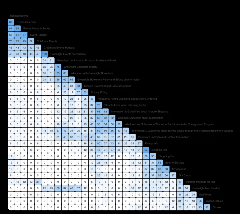
Based on the analysis above, this is the site map for our navigation bar, finalized after user testing and team discussions. The red boxes indicate simplified confusing labels, blue boxes represent reworded secondary labels, and yellow boxes highlight other key improvements.

  1. “Youth Book Clubs” was renamed “Young Reader Reviewer Program” for clarity, as users found it confusing during Card Sorting.

  2. “Join Our Mailing List” was moved under “Subscriptions”, aligning with user grouping in Card Sorting and validated by Tree Testing.

After building the new Information Architecture (IA), we moved on to redesigning the website. To guide our redesign, we first planned a series of user tasks to ensure we focused on creating the right pages.

Task 1: Purchasing a book
The most important function of a bookstore website is to allow users to browse and purchase books. Based on insights from user interviews, many participants mentioned that they prefer finding books by genre. With this in mind, we designed this task to guide users through finding a book under a specific genre and completing the checkout process.

Task 2: Viewing past orders
Based on feedback from Card Sorting and Tree Testing, users naturally look for their past orders under their personal account page. To address this behavior, we designed this task to guide users from the homepage to the “My Account” section and help them locate their past orders efficiently.
(We decided to include this task after conducting user testing, so many “My Account” pages were created later in the process. However, we ensured their functionality by testing them internally among team members.)

Next, we started building the wireframe. Below are some of our initial design screens.

Home Page (Top)
Home Page (Bottom)
Result Page
Book Detail Page
Shopping Cart
Check-Out Page

We also designed a mobile version of the interface, incorporating all the features from the desktop version with slight adjustments for mobile usability.


For example:
The navigation bar is now housed in a hamburger menu.
● Only the search and shopping cart icons are retained in the top-right corner.
● Browsing books requires horizontal swiping, and the genre options are displayed as buttons for easier access.

Final Deliverable

We conducted user testing with 7 participants using our wireframes and documented issues that prevented task completion, along with other problems users encountered. We also brainstormed solutions for these issues and continued to refine our prototype

The main issues we observed are as follows:
1. Navigation Challenges: Users had difficulty navigating back to the homepage on mobile and expected clearer placement of key options, such as “Browse by Genre” under the “Books” section.
2. Label and Content Clarity: Some labels and content were unclear, leading to confusion. For example, users were unsure if “Best Sellers” referred to general or genre-specific books.
3. Confusion with Cart and Checkout: Users faced challenges in the cart and checkout process, such as unclear selection states for items in the cart and a disabled payment button when choosing in-store pickup.

We refined the design based on these results and finalized the prototype. The full desktop version can be viewed here, and the mobile version can be viewed here.

© YU-HSIEN WU 2025 | All Rights Reserved